A Digital Design System for a Custom Website
Design Systems
CXO @ The Inturnship
I build design systems that scale across teams, devices, brands, and digital ecosystems. My approach combines atomic design, rigorous organization, accessibility, and research-backed decision-making.
Overview

A mid-sized architecture firm approached us with a website that no longer reflected the quality of their work. Their digital presence was fragmented; visual patterns were inconsistent, content had become overwhelming and unstructured, and their brand had no clear path for growth online.
I led the redesign by creating a fully custom website built on a flexible, responsive grid and a modular, component-based system. This gave the client a scalable design foundation they could grow with. Alongside the design work, I delivered a comprehensive project guide outlining our shared goals, narrative-driven personas, and every digital design element created, giving the client clarity, alignment, and a sustainable roadmap for future updates.
What I Heard
When I begin a project, I start by crafting a strategic statement that defines the purpose of the work and the outcomes we’re aiming for. This becomes the north star for the entire engagement. It articulates why the client hired us, what success looks like, and how we’ll measure impact. I collaborate closely with stakeholders to refine the statement until it feels precise, motivating, and aligned. This clarity upfront reduces scope creep, accelerates decision-making, and gives everyone a shared direction for the work ahead.
SMCo is a team of placemakers deeply rooted on martha's vineyard, designing and building homes that become graceful additions to the island's story. We craft spaces that embrace the way you live and are cherished for generations.
Every home reflects a deep connection to our people and the land and a thoughtful commitment to sustainability and craftsmanship. These values have led us to expand our focus to include solar energy and community initiatives, as we work to shape a more resilient, connected future for the island.
The website should reflect our uniquely easy going, progressive and entrepreneurial spirit. It should be warm, approachable, and expertly crafted. It should invite visitors into the world of south mountain, offering a glimpse of what's possible and making it effortless to start the journey toward a place that feels like home.
“
Narrative Personas
To help the client’s team align on who the website was truly speaking to, I developed three narrative personas based on stakeholder conversations and real stories from their practice. While the budget didn’t allow for a full research track, these humanized composites still created meaningful alignment across the leadership team. I saw the CEO begin opening conversations with, “Which persona are we designing this for?” A clear sign the personas were doing their job.
These narratives informed tone, messaging, imagery, and the types of design elements we recommended to support conversion. Even without quantitative research, well-built narrative personas help teams make faster, more consistent decisions by grounding the work in shared understanding of audience needs and motivations.


System Foundations
Naming & Organization
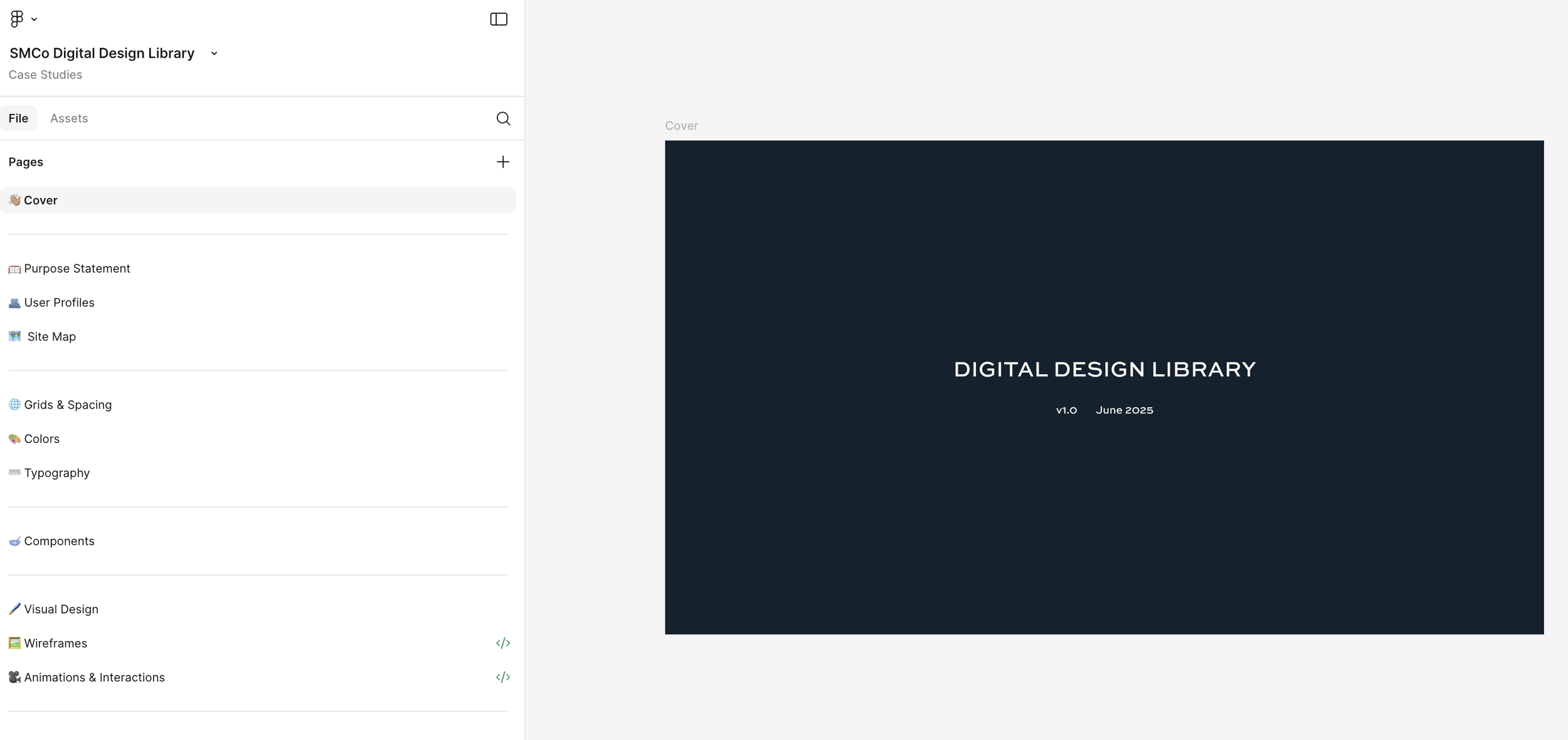
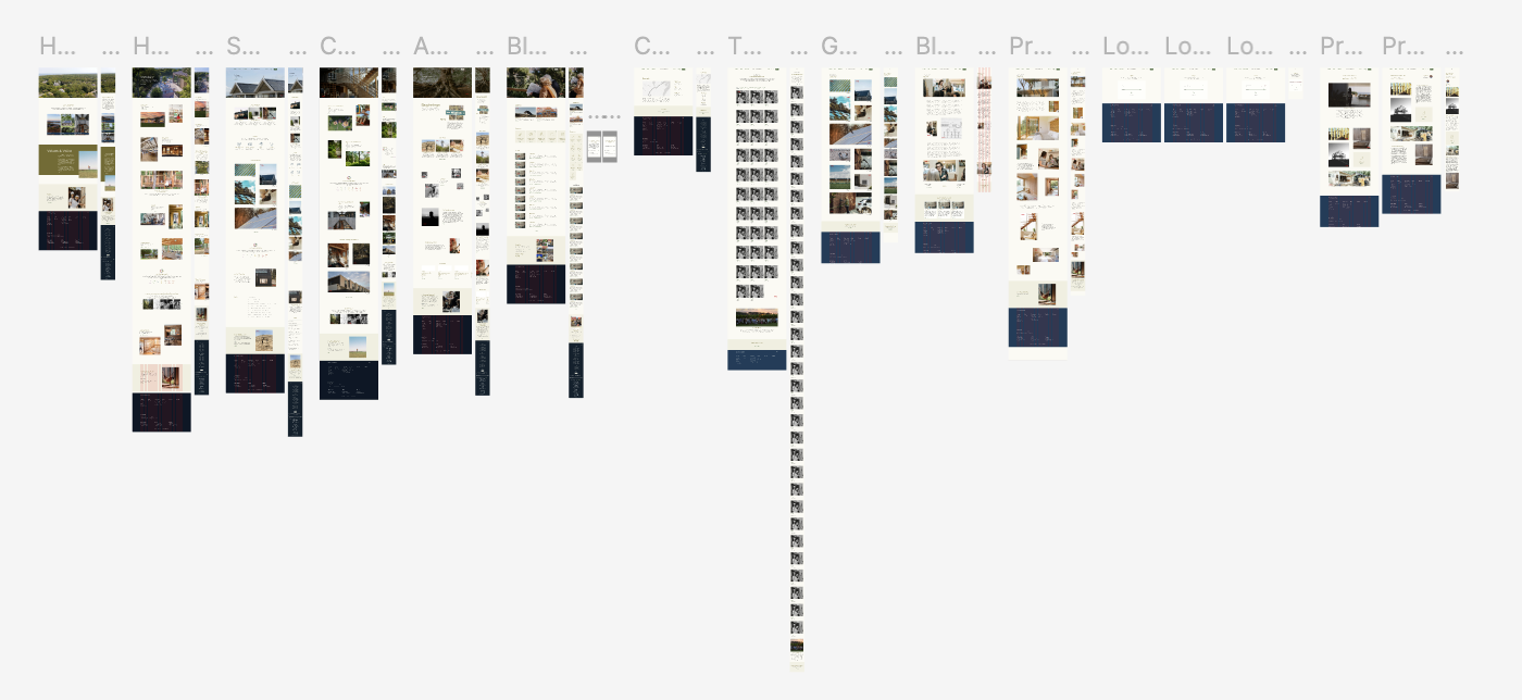
To make the system not only beautiful but truly usable, I established a clear and consistent naming structure across every Figma page, file, and frame. Each page was labeled in plain, approachable language, giving both the client and any future partners an immediate understanding of what lived where. This level of clarity reduces onboarding time, minimizes confusion, and ensures that anyone can navigate the system.
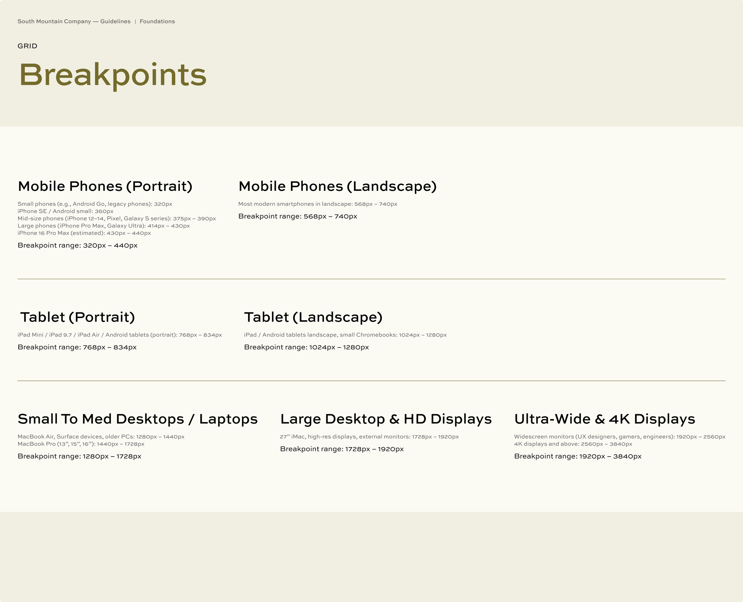
I also organized the file so that each major section had a dedicated slide. This created an intuitive, browseable structure where information is easy to locate at a glance. For example, the Grids & Spacing section includes its own set of slides: one explaining the spacing scale and why it was chosen, another showing column structures across devices, and additional frames outlining breakpoints for mobile, tablet, and desktop.
This thoughtful organization gave the client more than just design assets. It provided a long-term reference system that supports smoother collaboration, clearer decision-making, and easier future maintenance.


Type Families & Scales
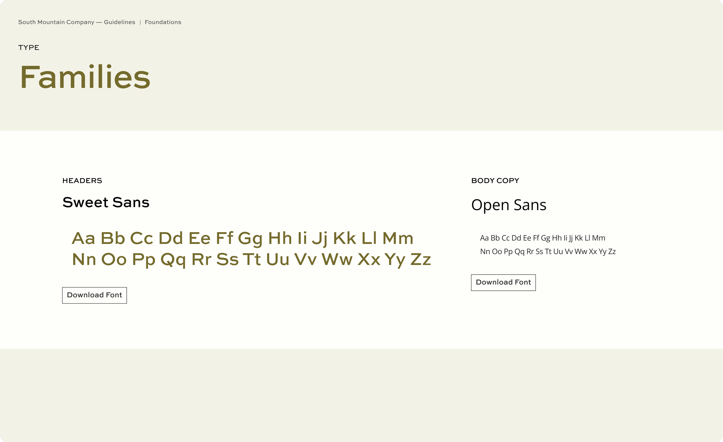
Our visual & graphic design lead, Stephanie Strys, curated a pair of type families that better aligned with the client’s evolving brand direction and performed far more reliably on the web than their legacy selections. Once the families were chosen, I translated them into a responsive type system by building type scale ratios for mobile and desktop.
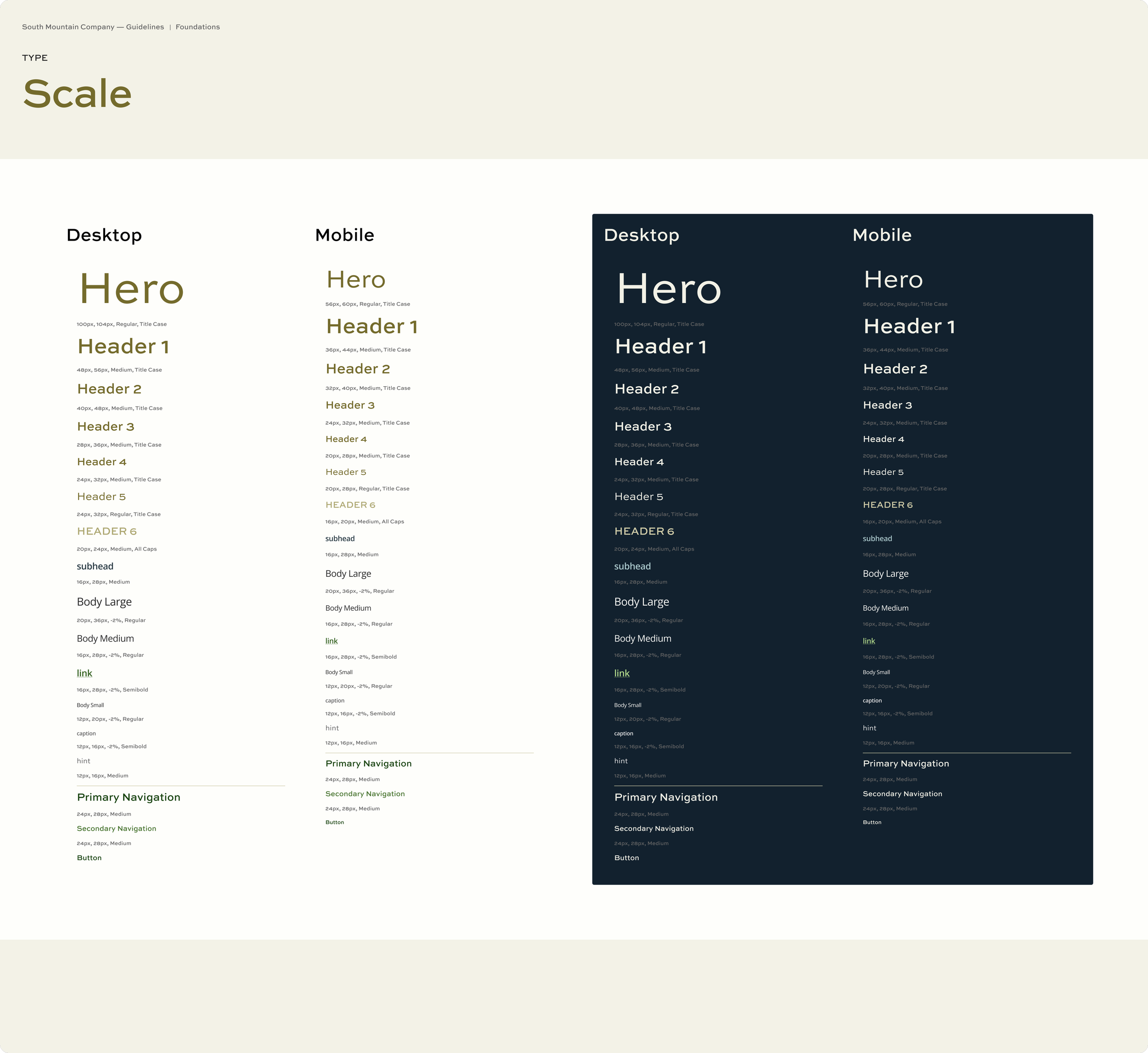
Establishing consistent type families and a well-structured type scale does more than make a site look polished. It strengthens brand recognition, improves readability, and creates a predictable rhythm across every page. By defining sizes, hierarchy, and responsive behavior upfront, the client received a typography system that looked cohesive and adapted seamlessly to different devices and viewports.
The result was a flexible, future-ready foundation that supports both their current content and any digital expansion they take on next.
Color Palette & Contrasting
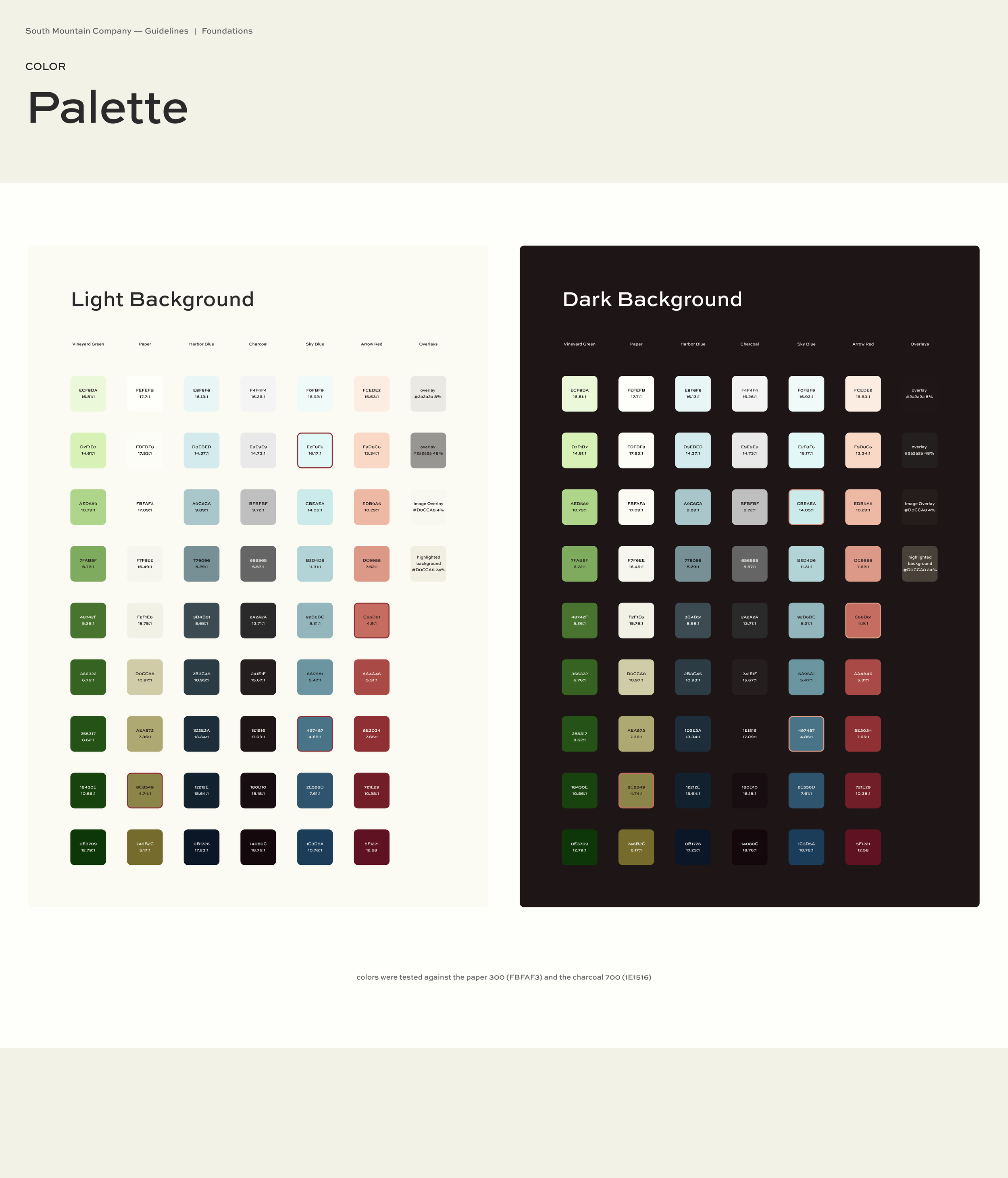
Stephanie Strys, our visual & graphic design lead, conducted multiple rounds of moodboarding and color exploration to thoughtfully expand the client’s brand palette. For a digital product, a narrow set of brand colors simply isn’t enough. UI requires a broader, more functional range that can communicate hierarchy, provide clear states, and remain legible across devices.
Once the client selected their direction, I translated those decisions into a full, systematic color scale from 100–900. This expansion ensured we had the range needed for backgrounds, text, interactions, and accessibility-compliant contrast pairs. I tested every color against WCAG contrast standards and documented the results, including guidance on which combinations were safe to use and which to avoid.
This gave the client more than a refreshed palette. It equipped them with a reliable, future-ready color system that’s both brand-aligned and highly usable. The expanded palette ultimately became part of their gentle rebrand, providing consistency and clarity not only for the website, but for all brand presence moving forward.

Component Structure
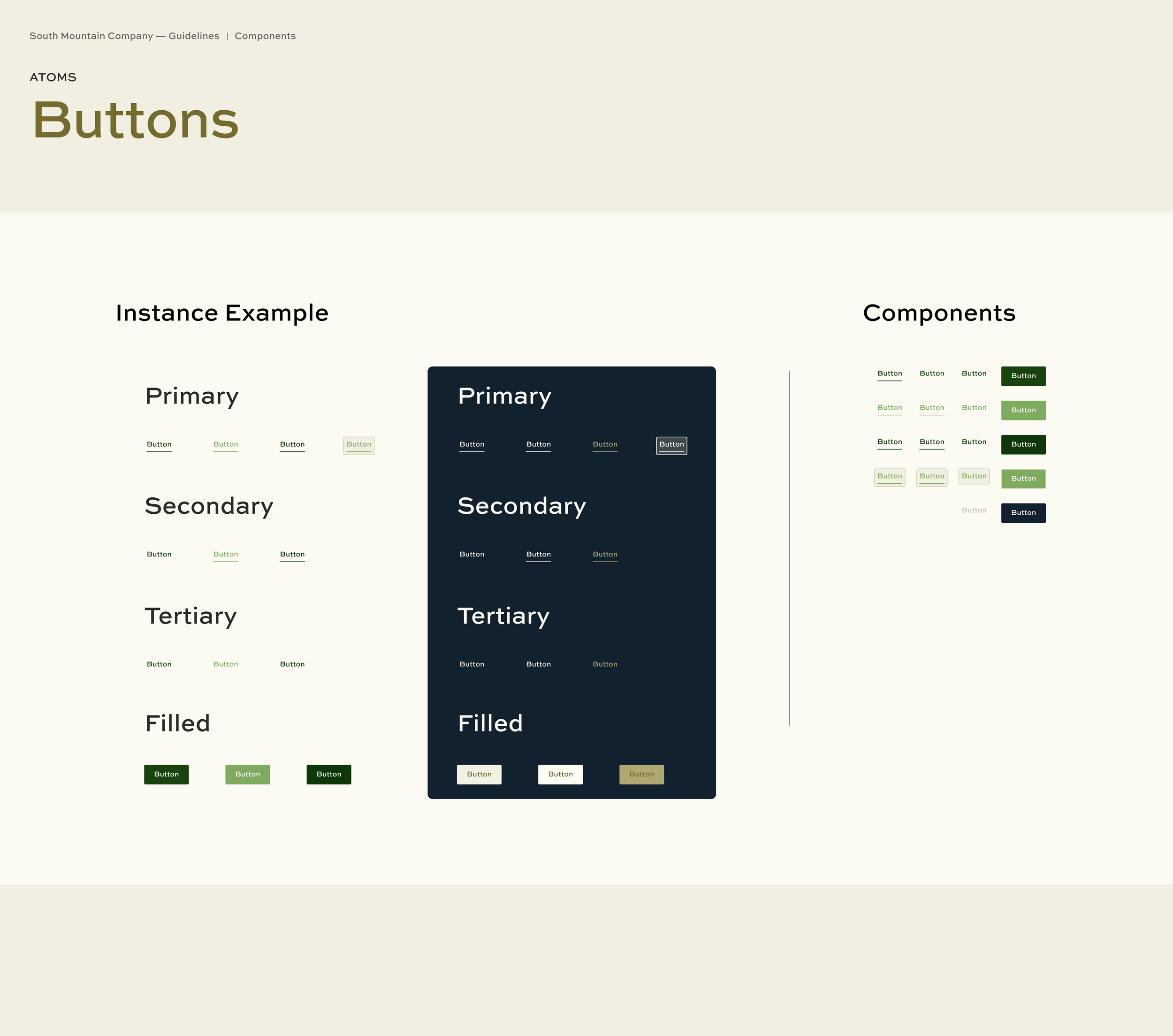
All components for the site were built using the atomic design method, which allowed us to create a system that’s modular, scalable, and easy for teams to maintain. Each slide in the documentation shows the master component on the right and a real-world instance on the left, making it clear how each element is intended to function in context. This structure helps both designers and developers quickly understand how to use the system effectively.
Every component was connected to Figma variables, including primitive and token variables for color, typography, spacing, and interaction states. This approach allows updates to be made globally, rather than manually adjusting individual components. It also gives the client future-proof flexibility: as their brand evolves, the design system can evolve with them simply by updating the underlying tokens.
The result is a component library that’s not only consistent and robust, but also genuinely easy for future teams to extend, providing long-term value far beyond the initial website redesign.
Experience & Interface Execution
Visual Design Collaboration
For the visual design phase, our goal was not only to create a beautiful interface. It was to give the client a tangible, aligned expression of their brand across both desktop and mobile. Working closely with the visual design lead, we defined modular, flexible sections that could expand as the firm added new case studies or evolved their services. This modular approach ensured the site felt cohesive today, while still being able to grow with the business tomorrow. For the client, this meant stronger brand consistency, easier content updates, and a site built to scale.
Wireframing & Prototyping for Development

The final step in the design phase was building detailed wireframes and prototypes to hand off to the client’s software development team. My goal here was simple: reduce development costs and prevent guesswork. By documenting interaction patterns, layouts, and component behavior in a clear, annotated way, we equipped their internal product manager and developers with everything they needed to implement the design accurately without relying on us through the entire build.
This approach gave the client autonomy, saved them substantial development hours, and ensured the design intent carried all the way through to launch.
My Learnings & Growth
Design systems are where craft meets purpose. They translate big ideas into practical tools that help teams move faster, communicate better, and stay aligned. This project reminded me how much impact thoughtful structure can have, not just on the final product, but on the day-to-day work of the team behind it. I’m grateful for the collaboration and proud of the system we built, and I’m excited to keep bringing this blend of strategy and design to future teams.